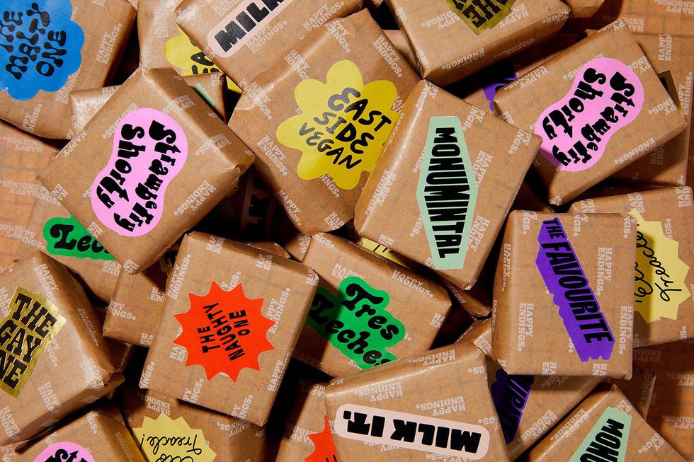
Established in 2014 by Australian pastry chef, YBF award winner and champion for Queer business, Terri Mercieca, Happy Endings is an ice cream brand defined by colourful chaos.
The partnership with London-based branding and design studio, Land of Plenty, came about in 2018 when long term clients of the studio, Yard Sale Pizza, asked them to design a sticker for their collaboration with Happy Endings. Land of Plenty loved the Happy Endings ethos and saw so much potential in the business, so they approached Mercieca and began sowing the seeds for a rebrand.
Fast forward to 2023 and Land of Plenty was asked to reinvigorate the business by evolving the brand and developing a planet-positive packaging solution that also increased the efficiency of the day-to-day roll-out of the product.
Terry Mercieca, founder of Happy Endings, comments: “I went to Land of Plenty in the hope of reinvigorating my company and to get a packaging solution that not only had a better impact on the planet but also created more efficiencies in the day to day running of the business.”
The goal for Land of Plenty was to blend Happy Endings’ inherent layer of nostalgia with the power of storytelling to create a place where everybody is welcome. The scope of work entailed everything from packaging to website to signage, point of sale and merchandise.
The challenge was to elevate the packaging to match the quality of the product, whilst making sense of the offer and expressing a brand that truly values people, planet and positivity. Through an extensive research and development process, Land of Plenty helped to engineer a sandwich wrap using NatureFlex (a plant-based film and alternative to harmful plastics) that is fully biodegradable, FSC-certified, and food safe too. The studio also created a fully planet-friendly packaging system and future-proofed identity framework for a changing product offer that champions diversity through individual expression.
Jonny Rowe, Founder and Creative Director at Land of Plenty, explains: “Part of the reason we approached them was because of the alignment we felt in terms of values and mission. The ethical side to what they create, and the people they partner with, as well as the importance they place on the environment - knowing that the ingredients they use come directly from nature - was a key guiding factor in the development of the biodegradable packaging suite.”
Land of Plenty’s approach to art-direction and photography broke all of their usual rules. This was about variety, unique perspectives and celebrating the joy of colourful characters. They adopted a language approach full of Aussie charm; built on contradictions, stream of consciousness, and a sprinkle of nonsense for good measure. In addition, the ‘rainbow sandwich’ gradient is a reference to both nostalgic ice cream menu boards and the brand’s LGBTQIA+ values.
The brand comes alive in the physical space as much as the digital. Land of Plenty designed all signage and menu boards using a flexible colour system that allows the offer to change through the seasons. The team created a logo mark inspired by the written word, following the premise that every good tale has a happy ending, just as every good meal has a tasty dessert.
Jonny Rowe comments: “We've built a real connection as both businesses and as people over the last five years or so, having navigated some uncertain times together, so it’s been especially rewarding to finally be able to hit the launch button.”
Terri Mercieca adds: “Land of Plenty has been the most unreal and wonderful design agency to work with. Every single person that works there is a dreamboat. They really care, their goal is to make the brand come alive in its most authentic way. To capture what you’re about and make it obvious.
For further information, visit https://yum.happyendingsldn.com/
